Landing pages have plenty of uses which makes them an indispensable part of any sales funnel , lead generation or marketing activity. Contact Pages are the place that the viewer of your content decided to act and get in touch. In this article, we will help you build a Contact Me landing page that will generate leads and conversions, increase search and website traffic, boost credibility, and ultimately, maximize your opportunities.
Recent posts
If you like this page please consider sharing it with your friends!
A good landing page is the entry point of your marketing funnel.
When you sell a product or a service, your need to make sure that your marketing efforts are targeted. That means that you communicate to each and every prospect with content that is relevant to them.
If you sell two kinds of T-shirts, one is for rock n’ roll enthusiastic men and one for mothers-to-be, you will probably run two different ads: one for the former and one for the latter. Each ad, when clicked, should link to a dedicated landing page. Each one is designed to communicate with its respective audience.
In other words, your landing pages should be made to drive segmented traffic to your online sales processes.
Good news! You can easily build these pages even if you don’t have a website. You can also easily integrate your landing pages with other parts of your sales funnels such as text messaging, emailing, transactional emails, tracking, and analysis, etc.
So, if you’re looking to grow your exposure, get targeted traffic to subscribe to your mailing list, showcase your brand, your business, a landing page will be the quickest and easiest way to take your marketing to the next level.
Before we start here are the Crucial things that your landing pages should have:
- Value proposition
- What’s in it for your prospects. What is the value you offer?
- Call-to-action
- What do you want your prospects to do. This is also knowns as your CTA (Call to Action)
- Examples: “Contact me” “Call now” “Email us” “Sign up”
- What do you want your prospects to do. This is also knowns as your CTA (Call to Action)
- Maintain attention
- Keep people focused by creating short, simple, and straightforward content. This should explain why you are to be considered in that line of business.
- Visuals
- Images or videos of what they are signing up for, which can invoke emotion and encourage them to take action. Basically, create audiovisual content that is good enough to leave an impact on its viewers.
- Social proof
- Who else has bought, consumed, read, or participated in what you’re offering? The idea is that people are easier to convince when they see that others before them have done or tried your product/services (and are glad they did)
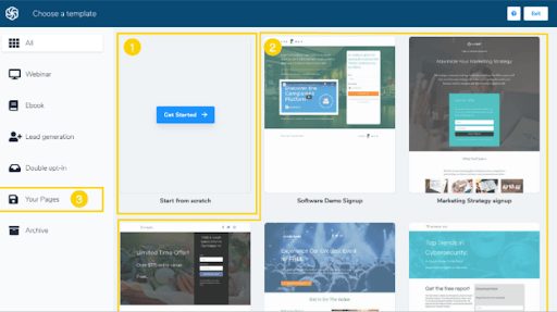
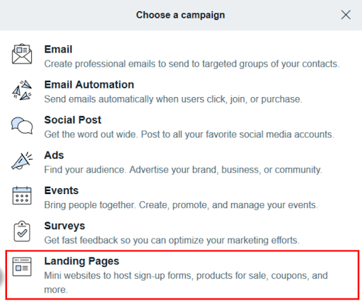
- Go to the Landing page section of your account and select “Create a Landing Page”
- Choose your template or you can also select and build one from scratch
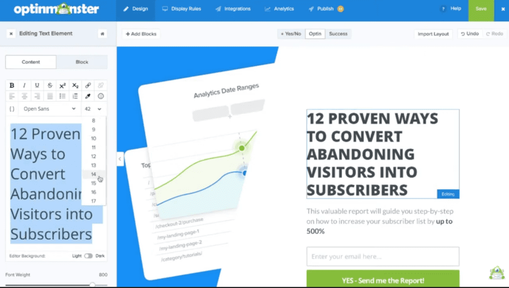
- Edit and customize your template
- Drag and drop elements from the right menu to customize your page
- After editing Click on the mobile Icon on the top menu to optimize page for mobile
- Click next step and input description
- Scroll down and setup landing page URL settings
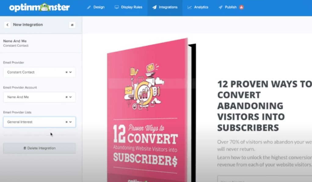
- Configure subscription settings by selecting the list where you want leads to be added to whenever they submit a form
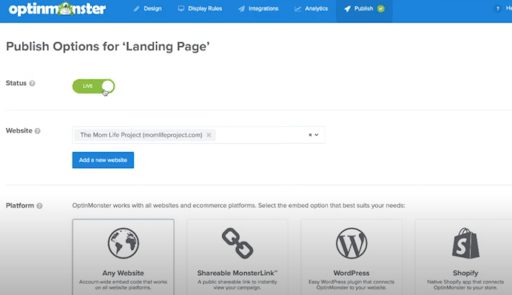
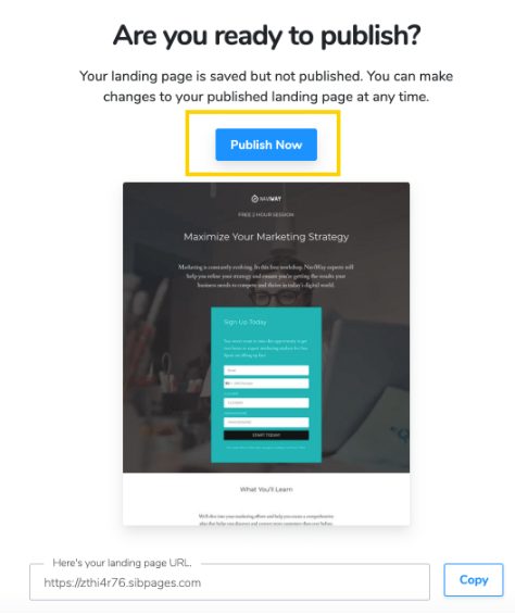
- And finally, click publish
Real quick and easy, right? So, to save you more time and to ensure conversion here’s another list of what your contact me landing page should contain:
- Information about you and your services
- Your contact information
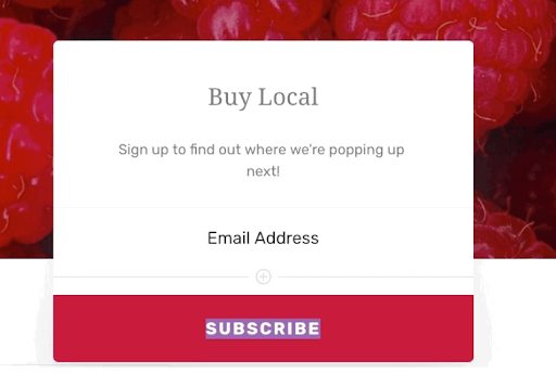
- Contact form
- Chat or messenger. We recommend using SalesIQ for a simple and very functional chat
- Links to your social media pages
- Tracking codes for display retargeting
